
A version of this article originally appeared in Australian Photography.
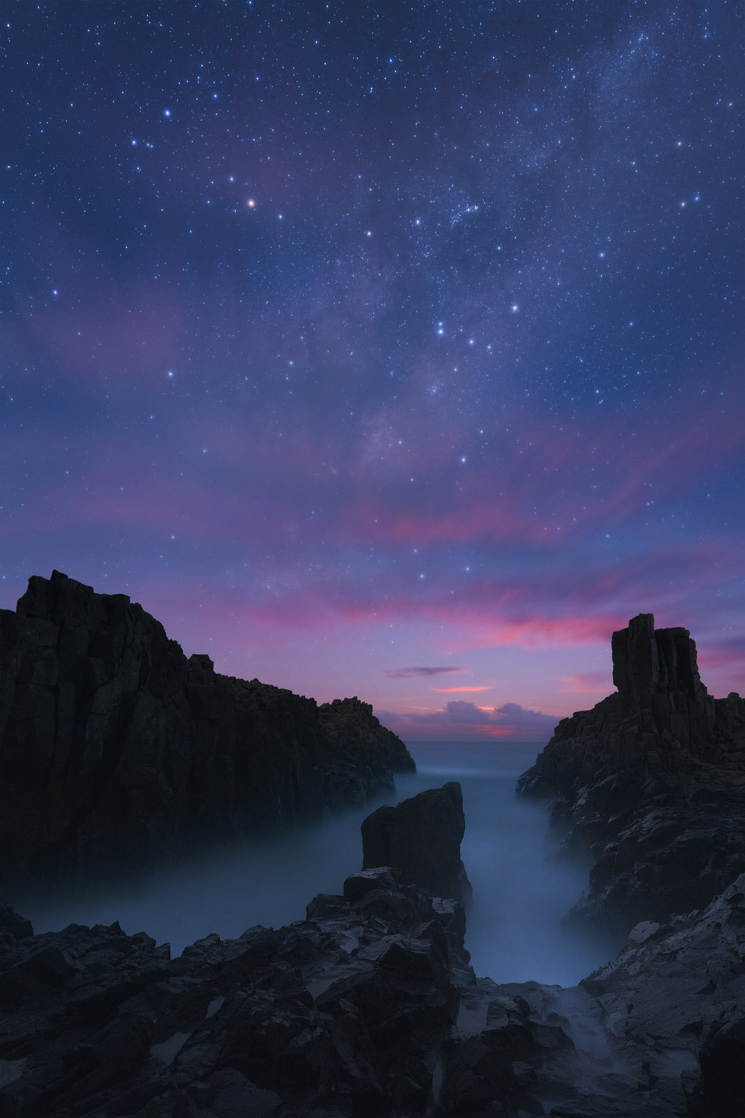
My love affair with landscape photography began with sunsets—big bold colourful sunsets. The overwhelming display of colour captivated my attention and has yet to waver. The promise of a ‘banging’ sunset on the cards still gets me excited. The glow in the sky. The reflections on the rocks and water. It’s the stuff stunning landscapes are made of. The epitome of ‘great light’.
My early forays into landscape photography drew me to lush rainforests and dramatic seascapes—even too the carnival of colour that is Sydney’s Vivid festival. Yet, like most things in photography when it comes to colour (and life), you can have too much of a good thing.
As our taste for photography and art matures, so too does our appreciation for subtlety and refinement. Experienced landscape photographers still appreciate saturation and vibrance—but their use is intentional and localised. They don’t just crank up Lightroom’s saturation slider and call it a day.
Side note, it goes without saying, but our taste for art and style is often subjective and personal. If you want to create monochrome images that emphasise light over colour, go for it. Likewise, if you want to create digital imagery of ethereal worlds, follow your bold ideas. Our art is an expression of our creative vision.
Yet if you’re looking to better employ colour in your landscape images, this article is for you. The sections and ideas that follow are relevant out in the field, but have greater application back in your preferred editing suite. Through refined post-processing—applied with consideration and intent—we can take a strongly composed image and elevate it to a lasting work of art.
A Mastery of Colour
Control & Constraint
Just because you can include a rainbow of colours, that doesn’t mean you should.
Our eyes are drawn to areas of high saturation. And so a kaleidoscope of colours is often distracting for the viewer, diminishing the impact of form and light. High saturation is best applied in targeted areas—such as foreground flowers or a mountain ridge alight with alpenglow—to better direct attention to prominent subjects.
Likewise, a wide variety of hues present in a single image may clash with each other, competing for our attention. Consider an example likely familiar to Australian landscape photographers on the coast: a sunrise by the sea with orange clouds, blue water, green seaweed and flecks of yellow from the rising run. The scope of colour here can be overwhelming and unsettling.
What might we do to better to refine the colours in this example? In the field, consider recomposing to remove the green seaweed from view or block the harsh yellow reflections. In post-processing, we could darken and desaturate the greens or shift the hue of yellow flecks to fall more in line with the clouds.
There’s no one trick or technique that can be applied to better control the colours present in our images. But a solid appreciation of Colour Theory goes a long way.
Achieving Harmony Through Colour Theory
Colour Theory is simple to grasp yet takes years to master. Yet even an elementary appreciation of the core concepts will transform how your images are presented and experienced.
Colour Theory is centred around achieving harmony in your images through colours that work well together. Ted Gore likens this harmony to playing a chord on the guitar:
“If the fingers are put in the right place on the strings, and the proper notes are created on each individual string, the chord will sound beautiful and harmonious. If one or more fingers press strings in the wrong place, the chord will not sound right... This is because certain frequencies of the sound waves work together due to mathematical relationships. Color is the same way. A color is just a specific wavelength of visible light, and when the colors that are harmonious to each other are combined in the correct way, they look beautiful together.”
There’s a whole collection of different colour harmonies (each with technical names, like Triadic and Quadratic) that help to bring balance to an image. If you want to delve deep into the theory, both Ted Gore and also Erin Babnik offer great, detailed articles on the topic.
Personally, I’ve found that the spectrum of potential categories is so broad, so encompassing, that they lose their impact. There’s seven and counting—analogous, monochromatic, complementary, split complementary, triadic, dyadic, and quadratic.

Let’s focus on the three colour harmonies that are easiest to recognise—and realise—in your own imagery:
Analogous: Analogous colours are neighbours in the colour wheel (such as a collection of cool or warm tones). Picture a lush waterfall scene with small patches of yellow light, or a cool blue seascape with wispy magenta clouds overhead.
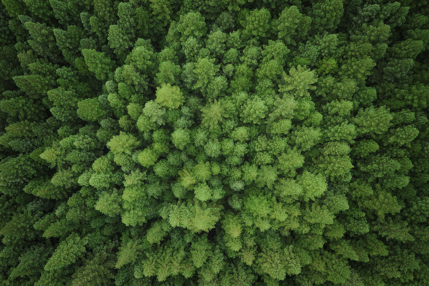
Monochromatic: A monochromatic colour harmony consists of a tight cluster of hues, with each varying in brightness or saturation to emphasise light and forms. Consider a cool twilight scene, or green foliage in a forest.
Complementary: Complementary colour pairs exist directly opposite one another on the colour wheel, and look great in contrast to one another. The classic example, particularly in Australian seascape settings, is blue water underneath an orange sunrise/sunset.
Essentially, Colour Theory boils down to, do the colours work together to help balance the overall image? Do they exist on purpose? Do they contribute to the intended viewing experience—or instead distract from it?
Depth, Attention and Mood
Landscape photos are two-dimensional—but that doesn’t mean they can’t convey depth. Just like dodging and burning can bring forward and push back certain areas, so too can colour.
Cooler areas tend to recede into the image, while warmer areas tend to come forward out of it. Consider cooling down the shadows and warming up the highlights to better direct the viewing experience. In a forest scene, you may want to cool down the less important undergrowth areas and warm up the fern fronds to better help them ‘pop’ out of the scene.
Traditional vignettes darken the fringes of an image to bring attention towards the main subject, and a similar concept applies to colour. Our eyes drift towards warmer areas in a scene, so look to avoid warm areas in the periphery as this can draw the viewer out of the photo.
Like depth and attention, manipulating colour tones helps to better establish the intended mood for an image. We may wish to cool down a forest scene to emphasise the eerie experience, or warm up a sunrise image to make it lighter and more inviting.
Style & Consistency
Lastly, refining colour with intent helps to create consistency across our images. And consistency helps to develop— and for others to identify—our personal style.
While our personal style is unique and couldn’t (nor should it be) prescribed, a richer appreciation for the power of colour will better equip us with the knowledge to create a distinct visual style across our portfolio.
This article’s intent isn’t that you’ll go away and make all your shadows cool and remove all traces of green seaweed from your seascapes. Rather, I hope you will be more attentive to colour in your own images and also in the work of others. To consider why you may want to refine them and what effect those changes will have on how others view your work.
Enough talk. Here’s how to put the theory into practice.
Let’s Get Practical
When it comes to refining the colours in our landscape images, there is no one size fits all approach, nor is there just one way to achieve a certain effect.
The best approach, I’ve found, is to experiment and then critically review the impact. Did the change help to achieve a certain mood? Did it make the whole image more harmonious? Did it bring attention to the subject?
With practice, you’ll soon develop a sort of intuition for when and how to refine the colour for each type of landscape scene.
Balance Your White Balance
White balance is so often given a passing glance as we make our way down the Lightroom sliders. Yet it can make or break an image. Forest scenes look unnatural if there’s too much magenta, while bold sunrises may be rendered too cool—particularly in phone photography when the extreme colours often don’t match what our eyes saw.

The easiest (and my preferred) approach is to shoot all your images in RAW using auto white balance. This takes away any second guessing colour rendition in the field (freeing up more time to attend to composition and light). Then when you get back to the computer, you can correct without degrading the image file.
The simplest approach here is to slowly drag the white balance sliders to their extremes and observe the effect on the photo. Perhaps an even warmer tone better suits the golden hour scene, while adding magenta might help to make the seascape sky pop.
Warm Light and Cool Shadows
Natural sunlight is warm—both in temperature and in white balance. Likewise, areas of shadow are often cooler in tone. To achieve accurate colour representation, ensure that your images reflect this natural colour separation where appropriate.
Using luminosity masks in Photoshop (or a luminosity range mask in Lightroom), try warming up the brighter areas and cooling down the shadows. The Split Toning module in Lightroom also achieves a similar effect. This colour separation between light and dark areas helps to create greater depth in the image.
Using a brush or mask, you may want to locally increase the warmth in your subject/s to direct attention towards key elements. Similarly, cooling down distracting elements will help them to recede back, reducing their prominence.
Achieve Colour Harmony
Have you tried to capture a lush green waterfall scene, only to discover sections of old branches with distracting red and orange tones? Consider using Lightroom’s HSL slider to cool down the warmer tones or reduce their saturation (and impact). Be careful not to drag the sliders to the very extremes as this can appear unnatural (and can create lines of colour banding), yet minor tweaks in HSL can minimise distracting elements.
Likewise, when looking to achieve a complementary colour harmony, trying using Photoshop’s selective colour layer to alter the hues of a third or fourth colour that is falling out of line. If you find the effect too global, use a layer mask to brush in the change over the area that needs refining. In the seascape example mentioned earlier, we could introduce more red into the yellow tones or cool down the green seaweed to help it blend in with the blue water.

Saturate to Accentuate
As noted, our eyes drift towards areas of high saturation. When an image has many saturated areas, our eyes jump around and don’t ease into the image towards our key subject. Like shifting colour hue, we can control saturation through HSL sliders, applying tweaks to the entire image (i.e. globally) or to specific areas through masks (i.e. locally) to accentuate certain elements.
Lastly, the appeal of an image may be the colours themselves—rather than the light or forms. In these cases, back yourself to boost saturation and draw attention to the bold colours present. A good opportunity to trial this is in more abstract scenes where the forms/shapes may be less attention grabbing.
Take Time to Revisit & Refine
I’ve lost track of the number of times I’ve ventured out on sunrise, experienced a ‘banger’ of a sunrise, chomping at the bit to get home to edit and share the image on social media that same day. Look at the stunning sky this morning, wasn’t it spectacular?
Yet these are the exact type of images that I’ll revisit later to reprocess again. In the excitement of the moment I often overlook areas of imperfection—areas that distract from the viewing experience. The saliency of the glowing sky or rushing water holds my attention, and I’m less attuned to the finer subtleties of light and colour.
To overcome this, I’ve given myself a rule not to capture, edit and share an image on the same day. Instead, I might make some initial edits on the day (such as a luminosity blend or global exposure/contrast tweaks), but then save the image as is. I’ll then return the next day or the next week and examine the image as a whole. What areas might I draw less attention to? How might I shift the colours to better create harmony in the image?
Approaching an image with fresh eyes allows us to clearly see it for what it is—all that’s great and all the flaws too. Instead of rushing to share your work, allow yourself the luxury of time to refine the image to its full potential.
Final Reflections
A richer understanding and appreciation of colour will improve the quality of your work and enhance how your images are experienced by others. Take the time to observe the range of hues present, consider how they support (or clash) with each other and how you might better control them.
Like most things in landscape photography, using techniques locally and subtly is more impactful than using them globally and strongly. When applying the theory and concepts explored here, start small. Observe the effect of each colour shift before making the next one.
It’s common to hear landscape photographers obsess over ‘great light’. And great light is essential to the craft. But so often, colour is just as important. It’s time we appreciated the value of ‘great colour’ too.
Want to sharpen your skills and take stunning landscape shots? Check out my 8 essential guides and lessons, packed with insightful theory and practical tips.