
Post-Processing: essential stage Or dishonest coat of paint?
Over the last decade of photography, one insight stands above the rest: Skilled processing won’t turn an average photo into a great photo.
Expert processing might turn an okay photo into a strong image. But going too far will stretch and skew the essence of the photo—warping the original scene beyond recognition.
That said, I’ll put my hand up as guilty party number one. For many years, I’d push and pull a photo in Photoshop so it no longer resembled the moment I witnessed. I’d look to photographers like Marc Adamus and Enrico Fossati who have mastered that heavy-handed approach and can create deeply moving images.

But for me? I now want my portfolio to retain a degree of integrity. For viewers to still notice ‘imperfections’ and feel the broad brushstrokes of nature.
Granted, your interpretation of integrity will differ from mine. It’s a highly subjective and malleable concept.
So here’s my rule of thumb: If you stood where I stood under similar conditions, you’d recognise my photo as an authentic, if partly idealised, representation of that scene. (That means no cloning or warping pixels—distracting leaves or rocks can be subdued through other techniques.)
Now we’ve established that foundational philosophy, here’s my three-step process for polishing landscape photos.
1) Control visual flow through the scene
I start by evening out exposure and contrast across the photo.
For harsher backlit scenes, I’ll often expand the dynamic range—and reduce the overall contrast. That means lowering the highlights and raising the shadows. (With intense sunsets, I’ll blend a separate darker frame into overexposed areas).
For more evenly lit scenes, the RAW files will be flat and lack punch. So I’ll often increase the overall contrast when there's a narrow histogram. In Lightroom, I use the white and black sliders to fine-tune a contrast boost at the high and low ends.
Once the overall exposure looks okay, I look for subtle ways to control flow and create depth through the scene. As I’ve written before, you can emphasise this by enhancing two of the three major types of transitions.
Here’s a quick overview of dark-to-light transitions:
Like leading lines and the rule of thirds, many landscape photographers use vignettes and dodging/burning. Why? Our eyes are drawn to more luminous, brighter areas.
By darkening the edges of an image, we drift towards brighter areas in the centre of an image.
A similar principle can be enhanced with cool-to-warm transitions:
Sunlight is warm (both in temperature and in white balance), while areas of shadow are often cooler in tone. As with dark-to-light transitions, cooler areas tend to recede into the image, while warmer areas tend to be brought forward out of it.
So what can you do to control flow? You might make local adjustments (through a brush or a radial filter) across specific zones/subjects to:
Lighten background shadows to enhance depth through the scene
Darken brighter areas near the front of your frame
Cool down closer subjects to lead up to warmer sunlit background subjects
2) Create balance and harmony
Once the image is broadly well exposed, it’s time to evaluate how all the separate elements complement or contrast one another.
One powerful idea to help evaluate that harmony? Colour theory. In my guide on colour theory, I wrote:
Just because you can include a rainbow of colours, that doesn’t mean you should.
Our eyes are drawn to areas of high saturation. And so a kaleidoscope of colours is often distracting for the viewer, diminishing the impact of form and light. High saturation is best applied in targeted areas—such as foreground flowers or a mountain ridge alight with alpenglow—to better direct attention to prominent subjects.
Likewise, a wide variety of hues present in a single image may clash with each other, competing for our attention.

The three colour harmonies that are easiest to recognise—and realise—are:
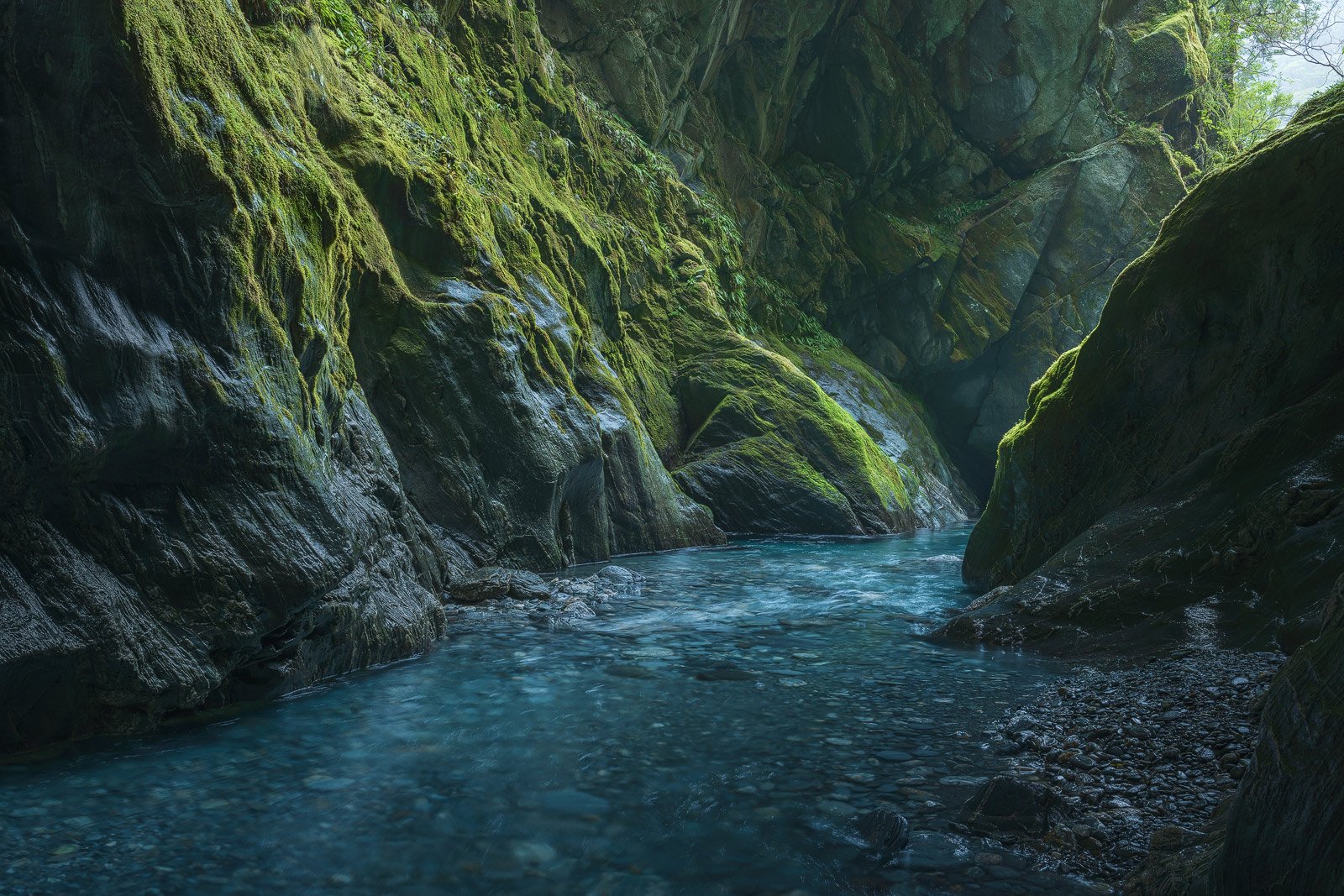
Analogous: Analogous colours are neighbours on the colour wheel. Picture a lush waterfall scene with verdant foliage or a cool blue seascape with wispy magenta clouds overhead.
Monochromatic: A monochromatic colour harmony relies on a tight cluster of hues, with varying brightness and saturation to emphasise light and form. Consider a scarlet sunset silhouette or golden sand dunes.
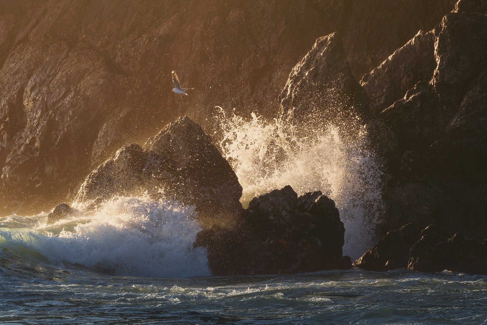
Complementary: Complementary pairs exist opposite one another on the colour wheel and look great in contrast to each other. The classic example? A seascape with blue water flowing under a golden sunrise.
Let’s apply the theory with an example. You’ve got a sunlit forest scene with ferns and mossy trees. So to create a more analogous (green and yellow in this example) harmony, you might:
Reduce the saturation of blue in overhead sky patches
Nudge the red and orange trunk hues to be more yellow
Lower the saturation and luminosity of magenta leaf litter
The key here is subtlety. You don’t need to alter or eliminate every competing colour. Often, a slight shift to a few hues and saturation levels can make a large difference and establish harmony.
As with colour, consider the finer distribution of luminosity. How are areas of light and shadow in balance across the frame?
Using a luminosity mask in Photoshop, I’ll often brighten areas of intense shadow so the viewer’s eye doesn’t get stuck there like a black hole. Likewise, in the periphery of the frame, I’ll darken bright patches so viewers don’t drift off from the central zone of the image.
Essentially, this second stage of creating balance boils down to: Do the varying colours and luminosities work together to enhance the viewing experience—or do they distract from it?
3) Let the photo sit—then make it pop
It’s natural to want to share a glorious sunrise the same day you saw it. I’ve lost track of the number of times I’ve experienced a ‘banger’ of a sky and returned home chomping at the bit to post the scene on Instagram. Look at the stunning sky this morning, wasn’t it spectacular?
Yet, as I know all too well, in our rush to get the photo out, we often overlook easily remedied processing errors. The white balance might be way too warm. Or there are too many bright distractions around our main subject.
In the excitement of the moment, the saliency of the glowing sky holds our attention, so we’re less attuned to the finer subtleties of light and colour.
To overcome this, I’ve given myself a rule: Don’t capture and share a photo on the same day. Instead, I might make some initial edits on the day (such as global contrast and colour tweaks), but then I’ll let the scene sit.
After some time has passed, you can view the photo more objectively with fresh eyes. What areas might you want to draw less attention to? How can you shift the colours to balance the scene?
This slower process is key to noticing—and then neutralising—distractions that steal attention from your subject. Particularly in the periphery (as these will draw viewers out of the image), search for distractions like stray branches, clashing yellow seaweed or bright patches of sky.
Lastly, letting your image sit will help you notice whether it needs a final pop. (Or toning down, too.)
You might enhance contrast in the midtones without crushing the blacks or blowing out the whites. Or you might raise the overall brightness while darkening the edges. (A simple vignette may be Photography 101, but it works for a reason.)
Final thoughts
My approach to processing is grounded in subtle local adjustments layered on top of one another. (Rather than global, strong ones.) So if you’re eager to apply the concepts explored here, start small.
Take time to observe the range of hues and luminosity present. And consider how they support or clash with each other. Then, observe the effect of each adjustment before making the next one. Don’t apply edits blindly (like the Orton Effect or heavy vignettes) simply because you saw a processing tips video or article (like this one).
Some images might only suit a handful of discrete processing steps. While complicated exposure blends with focus-stacking will require more finesse.
Each RAW file presents its unique challenges and opportunities. So take time to identify which elements aren’t balanced. And then trial different techniques to create harmony while retaining authenticity.
For me, processing is classic problem solving, with no correct approach or ‘perfect’ final outcome. It’s all about the process—and that journey is half the reward.
Want to sharpen your skills and take stunning landscape shots? Check out my 8 essential guides and lessons, packed with insightful theory and practical tips.